Step into the richly layered world of Tim Neve at Decor + Design 2025, 16 – 18 July at Melbourne Exhibition Centre. It’s a delightful place where design meets storytelling, and every fabric, pattern and patina tells a tale!
 Known for his emotive approach to interiors and an uncanny knack for mixing texture, colour and print, Tim will be both exhibiting at Decor + Design 2025 and taking a workshop on Day 1 of the show, Wednesday 16th July. ‘The Pattern Appreciation Society’ will give emerging designers the confidence to use patterns boldly in both residential and commercial interiors, creating stylish layers that calm rather than clash.
In the lead-up to the event, we caught up with the Newcastle-based creative to unpack his design philosophy, explore his latest collaborations, and get a sneak peek at what attendees can expect. Whether you’re a seasoned stylist or just learning the language of layering, Tim’s insights are sure to inspire!
Let’s start with the vibe! How would you describe the aesthetic world of Tim Neve in three words?
Layered. Texture. Storytelling. There’s always a story woven through what I do – whether it’s in the mix of materials, the mood of a room, or the patina of a piece. It’s never just about aesthetics – it’s about the emotive visual response.
Your workshop at Decor + Design 2025 is called the ‘Pattern Appreciation Society’. What inspired the name, and what can attendees expect from the experience?
I mean, doesn’t that name just sound like something you want to be part of?! The Pattern Appreciation Society is really a love letter to the joy of mixing prints, textures, and tones. I wanted it to feel fun, tactile, hands-on – like a pattern party, really! We’ll get stuck into real-life samples and swatches, learning how to layer like a pro. From wallpaper to textiles, I’ll be showing how to create magic through materiality.
You’re known for layering colour, texture and print in expressive ways. What’s your golden rule when it comes to mixing patterns confidently?
You can totally mix, match – and clash – quite boldly, but I think the key is undertones. As long as your palette is pulling from the same section of the colour wheel (say warm tones) then it should all work together. Remember to experiment with the scale of your patterns too, for visual variety. If you’ve chosen a bold expressive pattern, you can match that to a more delicate, subtle print that acts as the back-up dancer to the main attraction.
For those who feel overwhelmed by swatches and base cloths, what’s one practical tip that can help cut through the confusion?
If you’re new to the world of textiles for interiors, just remember they aren’t that dissimilar from clothing. So consider what you look for when wardrobe shopping – eg. natural fibres over synthetic, but perhaps with qualities that make the finished product easier to maintain on a daily basis. Once you start reading fabric labels and getting a feel for the textures you naturally gravitate toward, it all becomes less daunting. And don’t be afraid to get hands-on – touch, test, drape it over a chair. Experiment, and let the fabric speak to you.
How do you approach pattern differently in a residential versus a commercial space?
Earlier in my career my design studio focused on commercial projects for a while, and I loved the freedom to really go big and bold – it was a playground for creativity. But these days I’m not afraid to approach pattern in residential spaces with the same gusto! And in my experience, personal style always trumps worrying about resale value. Tapping into the heartbeat of your own home and making choices that authentically suit will never go out of fashion.
You’re shining a light on some of your favourite Australian textile houses in this session. Why is supporting local so important in design today?
I always say we are so spoilt for choice in Australia! We have the most amazing stable of Aussie artists and designers to pick and choose from. Not only does it support local, it also makes a designer’s life so much easier – for example, as there is less lead time on products that need to be brought in from offshore. I was part of the original digital print wave in recent decades that has been so exciting as it means prints can now be produced on-demand locally. It’s like a candy shop for a designer to be able to customise patterns, colourways and basecloths to instantly suit their spaces.
Tell us about your most recent collab with Urban Road.
I’m so excited to unveil my new collection of wallpapers, cushions and artworks at Decor and Design. Urban Road have been a dream partner, we really share the same belief in creating beautiful, thoughtful pieces that people will love living with.
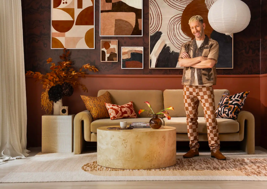
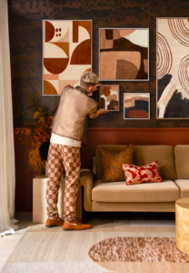
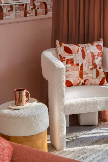
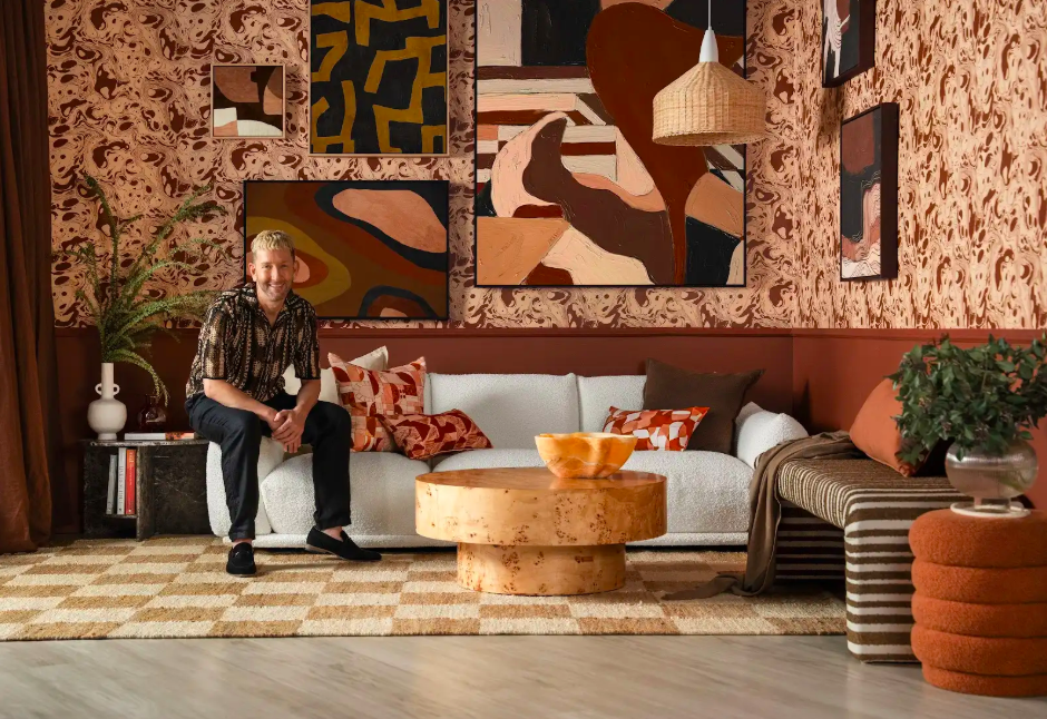
The ‘Artefact’ range is a continuation of my signature style, but evolved – it’s deeper, moodier, more layered. It’s homewares with heart, designed to feel like they’ve lived a life before finding their place in yours. The designs feel both ancient and modern, primitive yet polished. I think the industry are going to love the baseloth options for the wallpapers (including a divine grass-cloth style texture) and the large format artworks (that can be customised up to a massive 1.2 x 1.6 metre size, to really fill a wall.) I can’t wait to see how designers use the pieces in their spaces.
What do you hope people walk away with after joining the Pattern Appreciation Society?
It’s going to be a room full of creativity, connection and colour! After our session together in Melbourne I hope attendees walk away with a fresh and newfound confidence to pick up pattern and start applying it to their spaces – whether that’s a whole wallpapered room, or a statement cushion – we’ll cut through the confusion together and dream up some winning combos. Whether you’re a beginner, or a seasoned stylist, I’ll be sharing my unique take on things, so there should be something in there for everybody.
Don’t miss this gorgeous session with Tim Neve at Decor + Design 2025. Register now to visit the show and reserve your place. Use code NEVE20 to receive a 20% discount on the session.