When international colour mavens Pantone released their top ten colours for Fall 2016, we spotted a distinctly spicy undertone to some of the hues. Whilst Antipodeans may be heading into warmer months, there’s plenty of inspiration for interiors to be found in these trans-seasonal lush tints – particularly when the rain drizzles down in Spring and a cosy interior is an absolute essential. We selected four of our favourite on-trend spicy tones from the Pantone collection and show you how to work these trends into sensual interiors.
Spicy Mustard (Pantone 14-09520)
This is by no means a mediocre mellow yellow. This is full-throttle, unashamed mustard yellow with a hint of renegade spice. In almost every culture, yellow means sunshine, happiness and warmth. It’s a jaunty spritz of cloudless days and a reminder of light glancing off one’s sunglasses. Mustard adds depth – it is a sophisticated and grown-up take on an old nursery school favourite. Spicy mustard is super bold when used as a standalone colour like in this pendant light fitting. Alternatively, it can be softened by hitching it with a sterling slate grey like Pantone’s Sharkskin 17-3914.
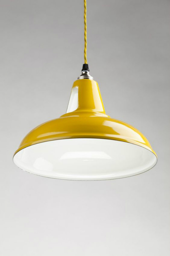
Pendant Lamp in Spicy Mustard. Image: Delightfull
Aurora Red (Pantone 18-1550)
This colour is as majestic as Aurora herself, the goddess of dawn in Roman mythology. It is quite a challenging hue that hits the senses without apology, which meant that it was once confined to safe accents or tinges. Be brave and use Aurora Red in a range of statement splashes, such as this incredible bathroom wall from Vining Design Associates. There’s something deliciously unexpected about walking into a room and being struck by this kind of pure, unadulterated vibrancy. We also love this interior because it cleverly plays off the nautical themes of red against the earthy red of native heritage. Divine.

Aurora Red Bathroom Wall. Image: Vining Design Associates
Potters’ Clay (Pantone 18-1340)
This shade has real depth and some of the earthiness seen in previous seasons. The neutrality of this tone is perfect for autumn and winter palettes. It is the colour of richly turning leaves and soft muddy, walks in the countryside. It is quintessentially warming, with undertones of russet and gleaming canine coats. Needless to say, it is the perfect hue for a cosy chair by the fire in a study or library.

Southern Motion Sofie Leather High-Leg Recliner in Potters’ Clay
Dusty Cedar (Pantone 18-1630)
Dusty cedar has rosy undertones that are reminiscent of Rose Quartz, one of Pantone’s colours of the year. It’s a fulsome pink with a ruddy, strong imprint which has overtones of cherry that have then been dusted down to a complex softness. It looks splendidly fresh and youthful juxtaposed against white, like in this updated country kitchen below.
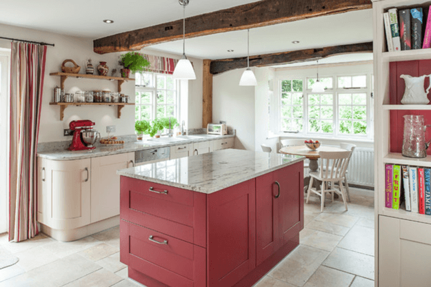
Dusty Cedar Kitchen Island. Image: JM Interiors
Subscribe now to Decor + Design to stay on top of the leading interior trends for 2016/2017 and get advance notice of the 2017 show in Melbourne. Missed Decor + Design 2016? Catch up on an interview with UK Trend Forecasters Scarlet Opus, who visited the show to give their tips on some of the design trends for the upcoming year.