Masterful use of colour doesn’t just happen. It’s a science. Experts spend years honing their skills to create palettes which can uplift, soothe, provoke or perfectly complement the landscape.
Arm yourself with colour knowledge from the experts at the 2022 Decor + Design Seminar Series at Melbourne Exhibition Centre in July. Andrea Lucena-Orr, Colour & Communications Manager at DuluxGroup, will be leading a Dulux Colour Application & Training workshop on Thursday 14 July, sharing her expertise on how to apply colour for both interiors and exteriors in a quintessentially Australian way.
Creative Director of Nexus Designs, Sonia Simpfendorfer, will be speaking on Saturday 16 July, in conversation with Lisa Green. With an international portfolio of prestige projects, Sonia will showcase how Nexus choose colour palettes and Australian artworks that complement our extraordinary light and landscape and can also be transported internationally.
Decor + Design will feature over 250 exhibitors showcasing their latest collections across furniture, soft furnishings, lighting, art and textiles. Register now and start planning your trip!
In the meantime, here are three key colours from international paint powerhouses which we think have perfectly translated the 2022 mood.
Sherwin-Williams – Evergreen Fog
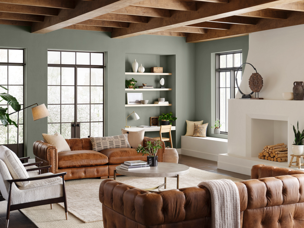
‘Evergreen Fog’ by Sherwin-Williams. Image: House Beautiful
Legendary American paint company Sherwin-Williams selected Evergreen Fog as their 2022 colour of the year. It is a subtle grey-green that provides comfort and rest – ideal for an entry hallway or to establish quiet and calm in bedrooms. Its restorative energy is ideal after the continual flux of the pandemic.
Another green we love is Mildura from Dulux – a warm, deep green and one of the key colours you’ll see at Decor + Design in July. Immerse yourself in calming colours on the show floor which also reflect the Australian landscape.
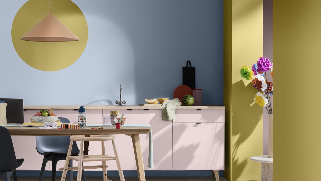
Dulux 2022 Colour of the Year – Bright Skies
‘Bright Skies’ by Dulux. Image: Dulux
Dulux’s colour experts selected ‘Bright Skies’ for 2022, a fresh tone that will lift any space. This transformative shade is literally a breath of fresh air after the pandemic. Dulux also selected four complementing palettes to inspire designers across the world.
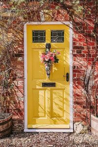
Farrow & Ball – ‘Babouche’
 Cult British paint and wallpaper manufacturer Farrow & Ball are famous for their delicate hues and the unusual names of their paints.
One of the colours they selected as key for 2022 is ‘Babouche’, a cheerful and uncomplicated colour. It is bold without being overpowering and perfect to inject joy into any interior.
Babouche is named after the soft slippers traditionally worn in Morocco and is a vibrant, uplifting choice. If you feel it is too strong for a whole room, consider it as an accent across a dark or neutral canvas.
We love the idea of Babouche as a bright, welcoming door against a rusty brick and climbing plants (Image: Farrow & Ball).
Don’t miss the 18th edition of Decor + Design, 14 – 17 July at Melbourne Exhibition Centre, and the chance to learn colour from Andrea Lucena-Orr and Sonia Simpfendorfer. Other speakers include Collette Dinnigan, David Hicks, Jamie Durie, Shaynna Blaze, Adelaide Bragg, Anna Spiro and many more! View the entire Seminar Series program here and register now to plan your trip to Melbourne! Entry to the exhibition is free but limited to trade visitors. Seminar tickets are available from $55 – 75.