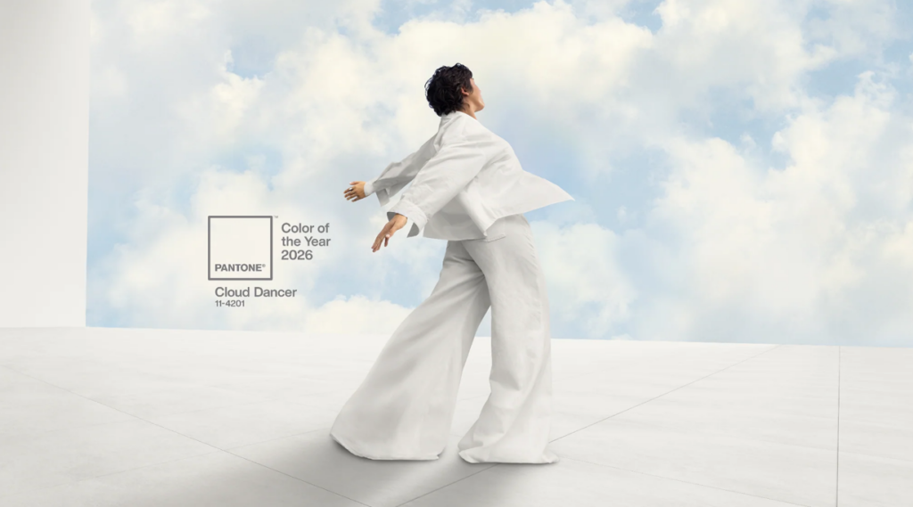
NEWS: Pantone has chosen PANTONE 11-4201 Cloud Dancer, a “soft, billowy and eternal white”, as its Colour of the Year for 2026, stirring up conversation across the design world. Is it a jarring statement given the times? Is it even a colour?
Since 1999, the internationally renowned colour institute has selected a colour which reflects the zeitgeist. Although it perhaps doesn’t hold as much sway as it once did. Post-covid and in the fractured social media world, agendas aren’t set with such ease by names like Pantone, Vogue et al. However, their annual selection still catalyses reactions across the world of interiors, furniture and fashion.
According to Leatrice Eiseman, Executive Director of the Pantone Colour Institute, Cloud Dancer is “a calming influence in a frenetic society,” offering a sense of measured reflection and emotional disconnection from the chaos of modern life. It symbolises calmness, clarity and a desire for respite in an overstimulated world.
On the other hand, publications like The Guardian and Vanity Fair are calling the selection of a fairly bog standard white “pantonedeaf” (the latter bon mot hails from The Guardian UK). White is a colour, yes – although it is the absence of any colour pigment and the combination in light of all the visible colour in the spectrum.
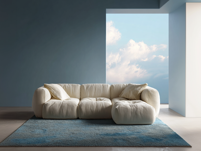
Image: Pantone
However, in a time when the Trump administration and his cohort have been attacking DEI programs and immigrants, if feels like the selection of this white is somewhat off. No matter how billowy it happens to be.
Cloud Dancer is undoubtedly a great hue for creating minimalist spaces and will pair beautifully with darker natural woods and stones. Pantone has also developed six curated palettes around it, ranging from tropical and vibrant to moody and glamorous. So they have, in fact, given us a diversity of colours to work with. It’s not that white doesn’t play a huge part in design. It’s that selecting a ‘Colour of the Year’ is also about reading the room. Which is why we’ve gone with something totally different for the Decor + Design Colour of the Year 2026.
Want More Bite? Enter Transformative Teal | Decor + Design’s Colour of the Year 2026
![]() Every year we select a hero colour for Decor + Design, Australia’s longest running interior design trade event, which reflects both current trends and our own direction. We love Transformative Teal, which was named by trend forecasting agency WGSN and Coloro as their colour of the year. This deep, sophisticated blend of blue and green embodies renewal, resilience, and an Earth-first mindset. It’s a colour that bridges the tranquility of blue with the vitality of green, making it both calming and energising.
Every year we select a hero colour for Decor + Design, Australia’s longest running interior design trade event, which reflects both current trends and our own direction. We love Transformative Teal, which was named by trend forecasting agency WGSN and Coloro as their colour of the year. This deep, sophisticated blend of blue and green embodies renewal, resilience, and an Earth-first mindset. It’s a colour that bridges the tranquility of blue with the vitality of green, making it both calming and energising.
When it comes to interiors, it’s also a versatile colour, working well as an accent wall or in textiles. It will also look beautiful with woods or metallic accents.
For us, it tallies with our 2026 theme of FRESH! With a playful new vibe and aesthetic, Decor + Design will be introducing multiple new focus areas at the 22nd edition, including Hardware Lane, The Surface Edit, DESIGNER DISTRICT and Hotel Lounge.
We will also be redesigning the 3rd edition of the Green Design Show into an architectural showcase. With its deep green tints, Transformative Teal resonates with themes of sustainability and wellness, making it the perfect choice for the 2026 show. It’s a colour that inspires both introspection and action and we believe it’s more in tune with the current moment.
You can see it in action in Melbourne from 15 – 17 July 2026. We can’t wait to see you all at Decor + Design: FRESH! Subscribe now to receive updates on the show and news from the wider world of interiors.