TRENDS: International colour forecasting powerhouse Pantone released their key colour for 2019 in December and it’s an eye-popping doozy.
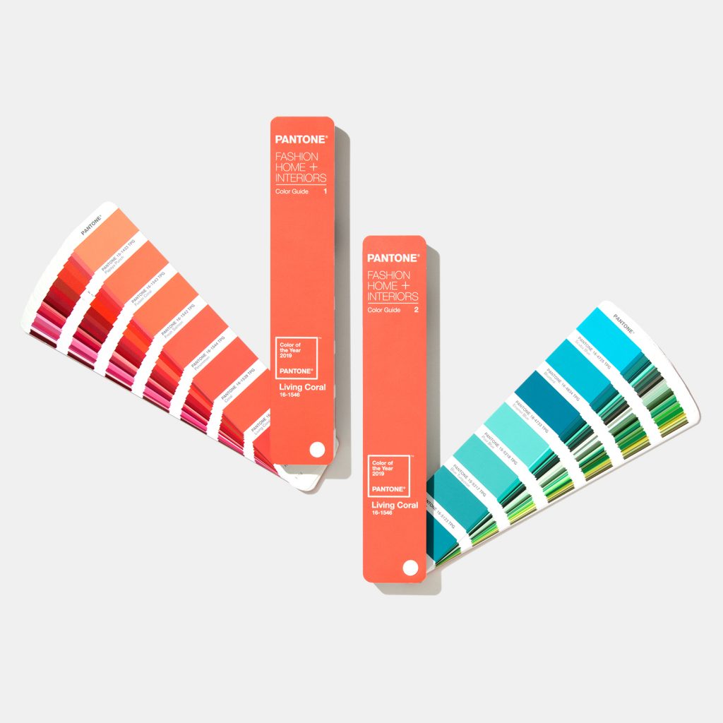
Living Coral (Pantone 16-1546) is a luminous pink, reminiscent of a salmon off to an underwater disco. Pantone describes the hue as an “animating and life-affirming coral hue with a golden undertone, that energises and enlivens with a softer edge.”
Just Who Is Pantone?
Pantone is a US-based company that has established itself as a global authority on colour, with its intricate colour-matching system dominating the field of creative design, print and fabrics.They began forecasting a ‘Colour of the Year’ two decades ago and its announcement has become a key watershed moment for the industry each year.
How is the ‘Colour of the Year’ chosen?
Rather like the new Pope. Twice a year the company hosts a secret meeting of international representatives from colour standards’ groups around the world. After two days of intense discussion and debate, they choose a colour for the following year.
It is important that the Colour of the Year connects with the zeitgeist. While 2017’s Greenery was a soothing, natural colour that provided relief in fractious times, Living Coral has been chosen to “demonstrate the authentic and immersive experiences that enable connection and intimacy.”

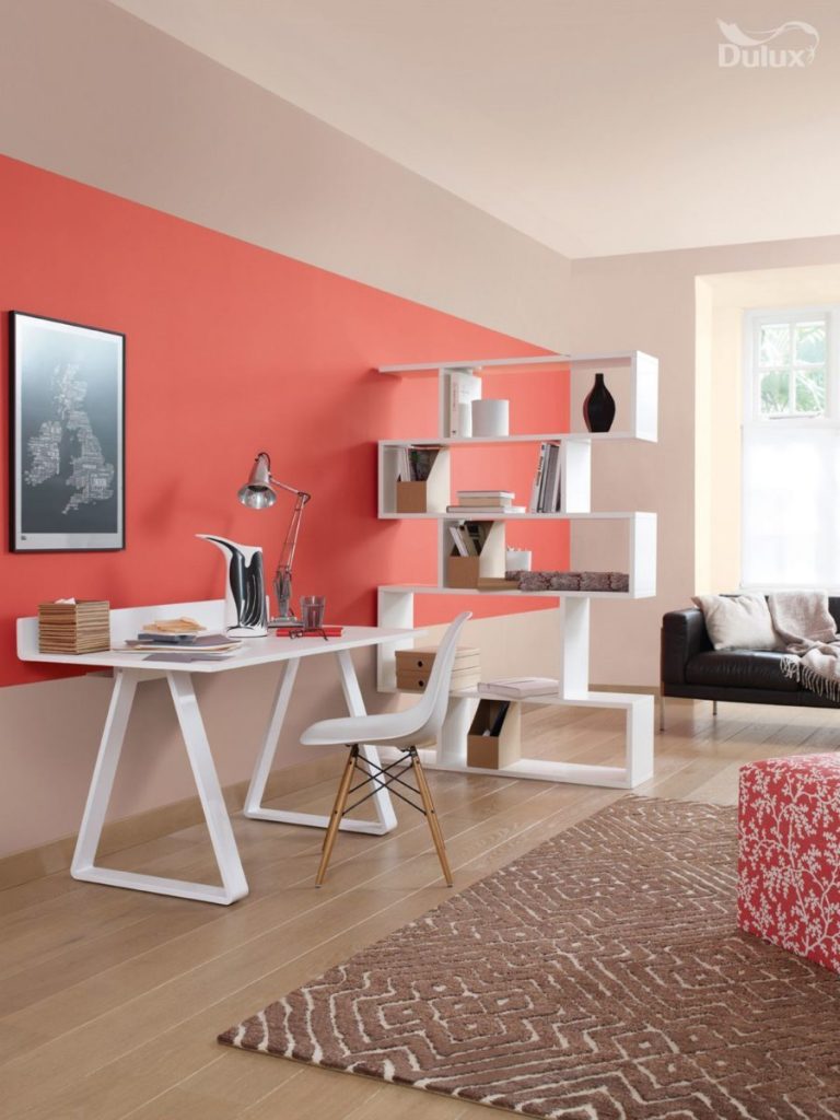
Feature wall in “Coral Flair” by Dulux. Image: Making Spaces
Leatrice Eisemann – CEO of the Pantone Color Institute – says that in an era when consumers are craving human interaction and social connection, “the humanising and heartening qualities displayed by the convivial Pantone Living Coral hit a responsive chord.”
How should I use it?
There are many arguments within the interior design community about how seriously to take trends. While there will always be a place for classic, timeless design, there will also always be a place for the latest fashions and refreshing the status quo.
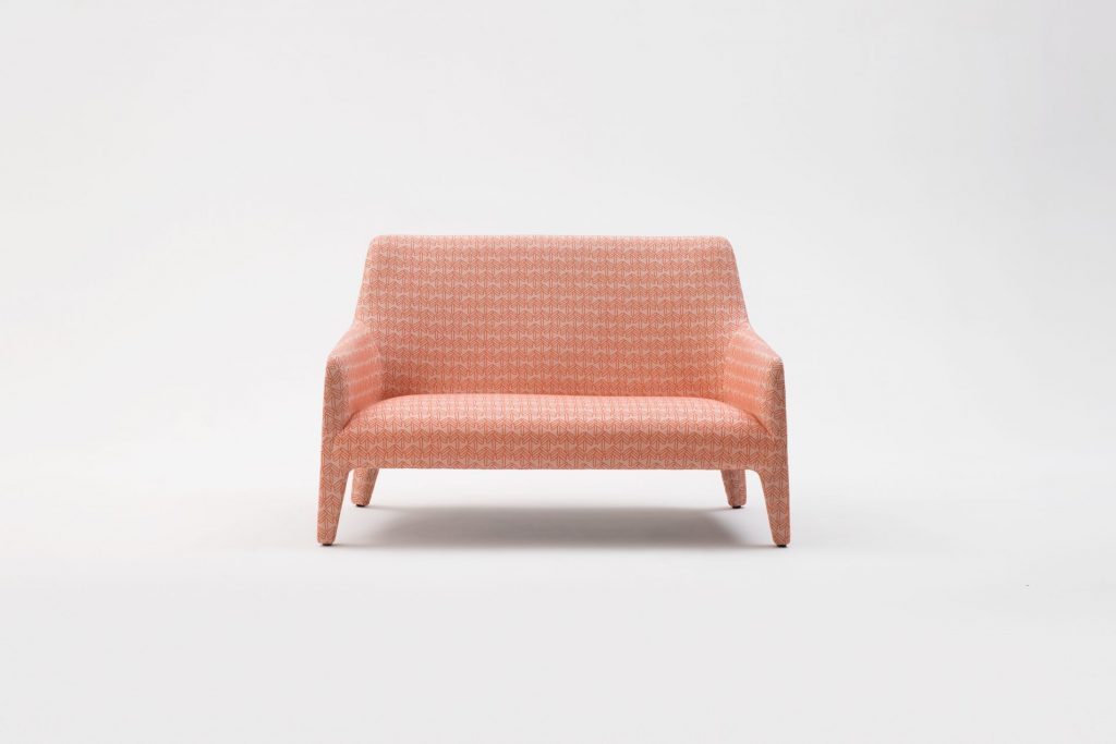
Use Living Coral on a feature wall in the garden to immediately brighten alfresco conversations. Or play with the colour in furniture fabrics, such as this gorgeous chair from Melbourne furniture-makers Jardan.
In a nutshell, Living Coral is a fun, bouncy colour for 2019. Our interiors can help shapeshift our emotions and connect us not only to others but to ourselves. Isn’t it time we all went dancing?
Subscribe now to receive updates on international trends from Decor + Design, Australia’s No.1 Interiors Event. You will also be notified when visitor registration opens for our next show in Melbourne, 18th – 21st July.

