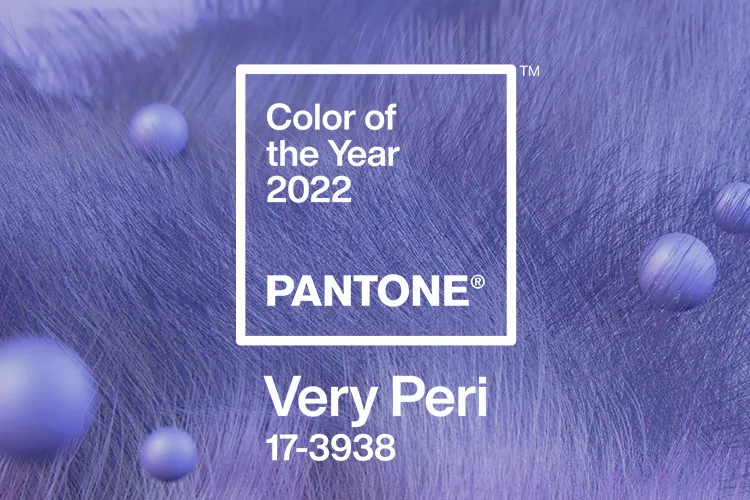
Prince (a.k.a The Artist Formerly Known As) would love Pantone’s new colour of the year. The international trends powerhouse has poured pure purple rain with their ‘Colour of the Year’ for 2022!
‘Very Peri’ is a fusion of periwinkle blue with a violet-red undertone. The result is an energising new purple hue that echoes tones found in nature and the virtual world but is totally unique.
‘Very Peri’. Image: Pantone
Now in its 23rd year, the Pantone Colour of the Year is chosen by a panel of international colour and design experts to reflect the global zeitgeist. To arrive at the selection, their experts analyse new colour influences from around the world and across industries, including entertainment, art, fashion, technology, social media and travel. It considers socio-economic conditions and emerging lifestyles as well as new materials, textures and techniques.
The final result has a huge influence on product development and purchasing across fashion, home furnishings and industrial design, as well as packaging and graphic design.
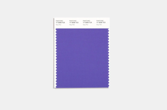
For the first time, in 2022 Pantone decided to create a new shade that wasn’t already in its existing catalogue of colours.
PANTONE 17-3938 VERY PERI was blended to invoke confidence and curiosity; to spur the creative spirit in a new, altered landscape of possibilities. It also illustrates the fusion of modern life and how colour trends from the digital world are being manifested in the physical, as well as vice versa.
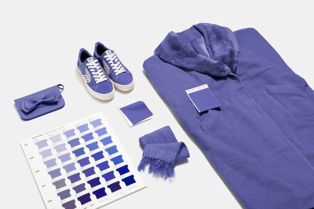
Image: Dezeen
A Courageous Colour for a Hybrid World
Our physical and digital lives have now merged in many ways, opening the door to a dynamic virtual world where we can explore and create new colour possibilities. ‘Very Peri’ reflects trends in gaming, as well as the growing popularity of the metaverse and artistic community in the digital space and the explosion in NFT artworks.
“The Pantone Colour of the Year reflects what is taking place in our global culture, expressing what people are looking for that colour can hope to answer,” says Laurie Pressman, Vice President of the Pantone Colour Institute.
“As society continues to recognise colour as a critical form of communication, and a way to express and affect ideas and emotions and engage and connect, the complexity of this new red violet blue hue highlights the expansive possibilities that lay before us.”
However, purple is not for the fainthearted designer! If you’re feeling a little trepidatious, here are some tips to inject ‘Very Peri’ into your interiors with chic.
Craft the Colour Palette Carefully
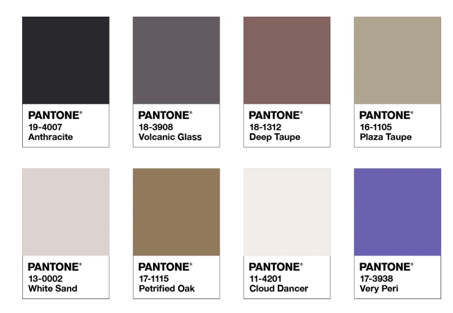
‘The Star of the Show’ Colour Palette. Image: Pantone
Very Peri airs well with white, pink, beige and green. It also can be used sensationally with orange and yellow. Note that it looks different in natural light compared to electric. Pantone also curates various palettes which will complement the Colour of the Year. For ‘Very Peri’, we like ‘The Star of the Show’, which surrounds the purple hero with a palette of classic, elegant neutrals.
Statement Furniture or Accessories
Add generous or restrained dollops of ‘Very Peri’ with a statement accessory such as a stuffed occasional chair or soft furnishings.
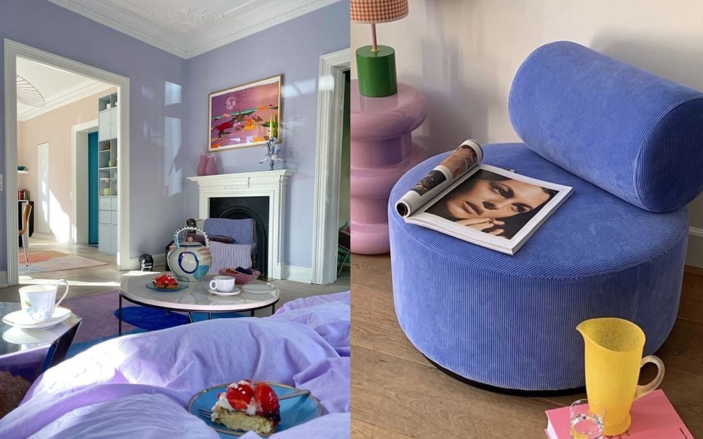
Image: www.nssgclub.com
Colour Blocking for Kids
‘Very Peri’ is a fun unisex shade that draws on the digital world and is perfect for kids’ rooms. Use it as a statement splash or colour block an accent wall.
See the latest colour trends and much more at Decor + Design 2022, which will return to the Melbourne Exhibition Centre from 14 – 17 July. Subscribe now for news and to be notified when visitor registration opens.